Tending to set lofty intentions on being a force for good, a force for change and a force for raising awareness - you could forgive a Dutch designer for not prioritising aesthetics in their work.

Anyway, there are already enough handsome chairs in the world, right? And with the Dutch tending to pioneer in planet-saving materials and bridging social divides through smart architecture and urbanism, emphasising appealing form might be a job best left to the Italians, the French or (dare I say it) the Belgians. Yet, on first view of the portfolio of Simone Post (Dutch Design Award winner in the Young Designer category) there’s no immediate sense that her work is up-cycling waste or creating a valuable vehicle for social change. What strikes first is her design’s sheer beauty.
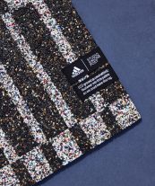
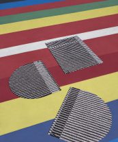
Post’s process in developing textiles is deeply scientific, and the purpose for, say, forming her eye-catching rugs from shredded old sneakers for Adidas is multi-faceted and far from being just aesthetically geared. By showcasing the potential of recycled materials, she pushes for systemic change within the broader design industry. She understands the importance of provenance, craft and collaboration too. When it comes to satisfying a traditional outsider’s view of ‘good Dutch design’ her work ticks all the boxes. But, asking Post herself why her work must be visually striking, she told me to not forget that the Dutch word for design is Vormgever, which literally translates to “shape-giver”. We shouldn’t forget design is about explaining something visually in a comprehensive way, she says.
Surveying the Dutch Design Awards (DDA) winners, from Post’s colourful creations to the artful digital delivery of complex data by Utrecht’s Clever°Franke, there’s an abundance of good shape-giving at play. From an international perspective it indicates where Dutch design is heading – somewhere smart, self-aware, globally relevant and aesthetically appealing. The world, meanwhile, simultaneously grows more connected, more polluted and more image-conscious every day. If a designer wants to have a positive impact on it, they have more opportunity now than ever before to do so, but part of the process is about looking good.
 1
1
 2
2
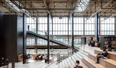
Enter LocHal in Tilburg, designed by Civic Architects, Braaksma & Roos Architectenbureau en Inside Outside/Petra Blaisse. It’s the well-earned recipient of the DDA’s Habitat category and a community building in a city unbeknown to most foreigners (sorry Tilburg). But Tilburg is a name I (and many other design appreciators globally) have had on the tip of our tongues this year thanks to the international exposure this well-publicised conversion of a former locomotive shed into a playfully designed library and community centre has rightly received. The overhaul is sensitive and its design is graceful – tough old industrial innards are softened by flowing greenery and handsome and gigantic, billowing divider curtains. Don’t get me wrong, in its effort to preserve the character of a historic setting and form a fully-functioning and completely flexible space, LocHal’s purpose is far from just being pretty. But for the many who have now travelled to see workings of this fine building, departing by night and looking back at the warm glow resonating through its all-glass exterior, it is hard not to admire this beacon of good Dutch design’s outstanding beauty.
Beauty can get a bad rap in design and the consideration of “aesthetics” is viewed with caution, particularly in academic circles. And while the Dutch design education system remains busy pioneering in the important work of bringing better design into everyday life – it’s also helping empower a growing confidence in the national industry beyond it. And it is this globally-minded group of designers that are simultaneously weaving beauty into the agenda themselves and it is paying off. Which brings me to a conversation with educator and respected Dutch curator Saskia van Stein, who sat on the jury for the Young Designer category. She says in the deliberation process questions had been raised on the work of winner Simone Post’s emphasis on her output not actually looking recycled (and actually just looking good). Perhaps in year’s past the physical highlighting of a remarkable innovation like up-cycled materials in a work of design might have been favoured. But today, it’s not needed. Dutch designers are confident, enterprising and know they’re doing the right thing. However, they may now be too busy working on solving the rest of the world’s problems to see that they’re also doing very beautiful work.
 3
3