Studio Laucke, Studio's Müller & van Tol i.s.m. Eric Wasch
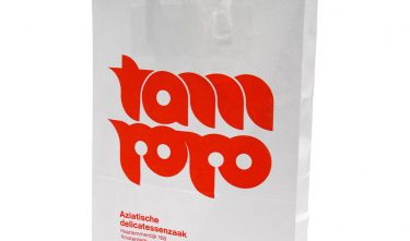
Tampopo
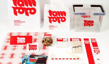
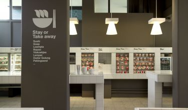
The project
A total concept for an Asian delicatessen business, based on a single shade of red – PMS032 – and a single material, namely white tiles.


Committee
A powerful and clear identity has been designed for this Asian delicatessen. The form of the logo is based on a circle, but despite that it still gives a strong Asian feeling through a design based on calligraphy. The correct use of simplicity has ensured that the identity has sufficient character.