Thonik
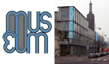
Museum Boijmans van Beuningen
The project
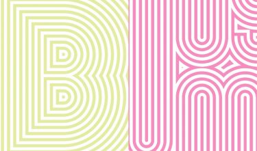
A new visual identity for this Rotterdam museum based on the existing one, with as most important change a restyling of the ‘Mexico 68’ font.

Committee
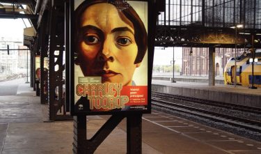
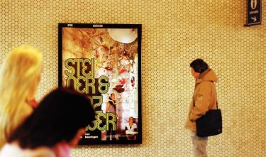
Art and culture are expressed in the choice of typography. What is unique is that the visual identity has both a formal and a lyrical side: the logo of the museum in the ‘Schulbuch’ is formal, while the name of the exhibition or the artist is expressed in a lyrical manner, in an ornamental graphic word picture against a background. The use of this exuberant letter image provides a kind of ‘branding’ for the information.