Hansje van Halem
Lowlands 2018

The project
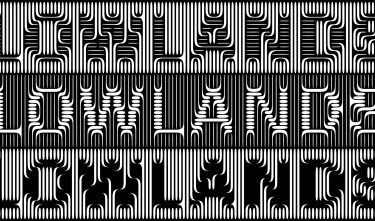
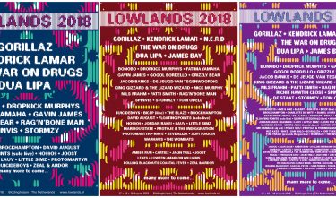
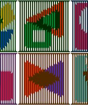
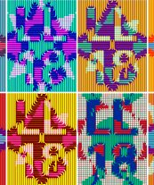
Hansje van Halem, the new head designer for Lowlands festival since 2017, bases her designs on a horizontal and vertical grid of lines in which letters, shapes and patterns – static or animated – materialise. With the addition of an unconventional colour palette, the toolkit for the festival’s 2018 edition is complete. Lowlands calls the style ‘optical illusion that’s perfect for festivals and music’. Van Halem wanted to make something bold and dynamic, standalone, distinctive and refreshing. A design that avoids festival clichés, presents plenty of design challenges, and is sufficiently flexible to generate striking visuals under intense time pressure and even during the festival, without having to deliver a simplified design.

Committee
Hansje van Halem’s mission has succeeded. The jury praises this kaleidoscopic new house style, in which typography takes the lead. We see the designer refining her skills and achieving new heights in specialist and intensive collaborations. The jury also admires the client’s courage. Lowlands was wise to opt for an individual designer rather than a large agency. Van Halem’s use of ingenious technological means to capture her recognisable style is both commendable and smart. The new Lowlands style is a fresh, innovative system that goes beyond identity. This is graphic design on a high level.


