Fabrique
Lowlands 2009

The project
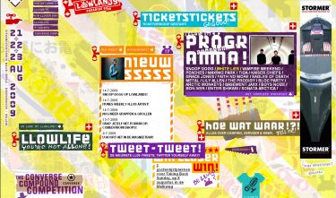
Since 1998, Fabrique has developed the website for the annual music festival. The change in the Lowlands 2009 website lies mainly in the interface. The designers at Fabrique have turned the interface completely on its head. They want the hectic nature of the three-day festival to be clearly visible on the website, too. Once you get used to the visual chaos, the official Lowlands website created by Fabrique works very nicely.
Committee
The Lowlands festival is young, adventurous, and hectic. The millions of visitors of the website will immediately find themselves in the right atmosphere. The first impression is chaotic. The visitor can browse through the site by picking up and dragging elements. At a loss? The ‘netjes’-button puts everything neatly in place.


