Cobbenhagen & Hendriksen
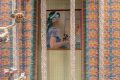
De Hallen Haarlem
The project
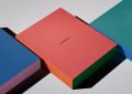
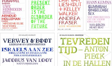
The museum’s identity is expressed by means of the consistent application of a vertical cut through every possible typeface. Inspired by the fragmented character of the building in which the museum is located.
Committee
A level-headed take on the subject has led to scintillating communication carriers. The simple starting point of a split building has been carried through in split typeface: a convincing intervention to unite primarily textual communication. This principle has also been implemented in the simple, clustered signage inside De Hallen.