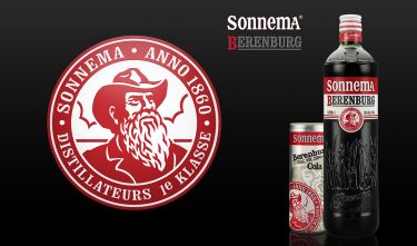
Sonnema Berenburg Bottle Packaging
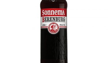
The project
Emphasizes the ‘Friesian character’ through which Sonnema can be better identified.
Committee
The design of the label, copy, and bottle are updated and refined to restyle the brand. The glass embossing is perhaps difficult to see, but the total effect is indeed one of higher quality. The jury did not receive the impression, however, that the ‘authentic Friesian coarseness´ that the restyling intended, was substantially strengthened.