75B
Ro Theatre
The project
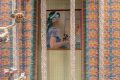
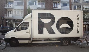
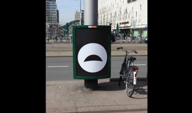
The Ro Theatre asked studio 75b to make a new visual identity, because they didn’t feel visible enough. 75b, who also designed the campaign for the International Film Festival Rotterdam, have restricted the visual identity to a logo that can be printed like a stamp on all RO Theatre communications. They didn’t feel that a complete visual identity suited the theatre company. The diversity of images used for the campaigns requires an open style.
Committee
The letters of the name Ro contain the pictograms for laughing and crying. Rather a cliché, but according to the jury it matches the programming of the Rotterdam theatre. The visual identity of the Ro Theater has recently been introduced and still needs time to catch on. With the appealing design, which offers great diversity of images, this will certainly happen.