VBAT
Buna Bet
The project
A new corporate identity for a worldwide franchise formula for the Buna Bet coffee house.
Committee
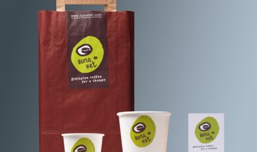
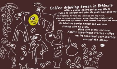
The material and the use of color in de whole house style are modest and have an original feel. The overall effect is pure and unpretentious. The logo is based on eyes, a theme that often recurs in Ethiopian art. The image language consists of simple line drawings that tell the story of the origin of the coffee, the coffee ceremony and about the Buna Bet coffee house. This approach is carried through in corporate statements, packaging, in-store communication and retail design.
Jury
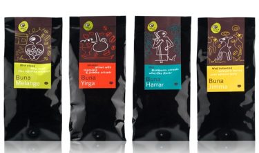
The original, ethnic line-drawn images on a shiny black background makes the coffee sacks a particular success. This quality could have been more widely carried through in carrier bags, cups and business cards. The social importance of the coffee ceremony is emphasized in the text on the coffee sacks, whereas elsewhere the focus is on Buna Bet’s corporate social responsibility with regard to developments in Ethiopia. This leads to the brand positioning becoming somewhat diffused.