Studio Dumbar
Alzheimer
 1
1
The project
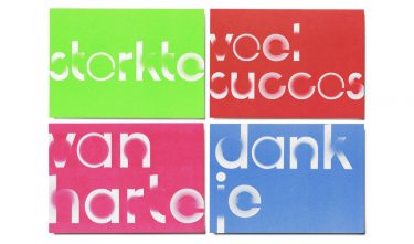
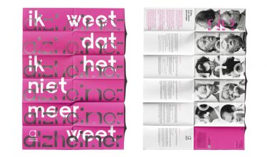
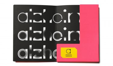
To achieve this new visual identity, the designers entered into conversation with Alzheimer’s patients, their families and carers. The ‘vanishing points’ in the typography visualize the effects of dementia, while some people see them as a source of light and hope. The new style for the Alzheimer’s patient organisation Netherlands shows a strong balance between content and corporate image.
 2
2
 3
3
Committee
The identity of Alzheimer Netherlands reflects both the organisation and the disease. With the fading letters and words, the designers capture the essence of what a person with Alzheimer’s experiences. Within the framework of requirements and limitations of a care setting, Studio Dumbar has put down an identity that is strong in its simplicity.
 4
4