Richard Niessen
The palace of Typographic Masonry
The project
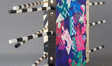
The Palace of Typographic Masonry is a graphic ‘structure’ that literally shapes the method and research into Niessen’s own field. He often seeks similarities with architecture and he ‘builds’ with graphic elements. The project’s title refers to the freemasons, the secret society full of symbols, with society being considered as a construction to be completed and the objective being personal discovery. The design of these posters runs parallel to the compilation of the content and is a form of designing research. In addition to posters a tangible set-up of ‘The Palace of Typographic Masonry’ has been designed.
Committee
This is a good example of a designer who starts a project based on his own initiative and puts his heart and soul into it. With this project he creates a new visual institute for graphic design, with an impressive result and unique visual language, in which his personal search is depicted as colourful dazzling metaphors in the design process. This Dutch designer has a clear signature and continues to reinvent himself in the fields of method and craftsmanship in silkscreen printing. The committee is also extremely impressed by the extraordinary spatial installation. With this nomination the committee celebrates the profession of graphic design and Niessen’s exemplary role.